For as long as they have existed our cities have been defined by their varied public spaces; places of commerce, places of politics and places of authority. Our streets were markets and informal communication networks - places of commerce and places of politics - whilst places to gather and indeed to be gathered such as squares outside palaces and cathedrals were spaces of authority.
Places of authority served a purpose; their wide open expanses helped to give prominent buildings scale via exposure. Fear of exposure kept people clear of these spaces and kept them free of activity; visit any large city square and you'll see that commerce and communication takes place on the periphery. On foot, people are nervous of traversing such larger open space; can they reach the other side safely? If they make conversation or do business in these open spaces who will see, who will overhear? In a restaurant, watch how people choose their seats and you'll see the same phenomenon in action; they always choose the edging chairs to eat. We like to sit up against walls, lean against partitions and feel enclosed. Nobody ever chooses the big exposed table in the centre of the room first, where everyone can watch you eating. It's the same in large scale places of authority. People hurry through if they have to cross, or go around the edges. Conversations, interactions and general "city life" take place on the more comfortable edges, leaving such city spaces largely clear,and giving us a frame by which to measure the buildings on the other side.
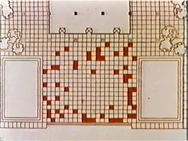
A diagram showing where people stopped to talk on Seagram Plaza in New York, from William H Whyte's Social Life of Small Urban Places, 1988
Crossing these "clear" spaces means submitting yourself to a process of exposure. The building as destination on the other side becomes a sanctuary - the clear goal for our journey. In the case of ancient cathedrals across large city squares the building becomes a literal sanctuary following the trials of a pilgrimage; the traveller must endure the fear of exposure by crossing the space before being embraced by the safety of the building on the other side.
As Richard Sennett points out in his book "The Conscience of the Eye" the word authority comes from the Latin root meaning of auctoritas; "the guardian who cares for those who cannot care for themselves, or the advisor of those who are uncertain." (1992, p.36, p/b 1st ed). It could be argued that traditional exposing spaces such as city squares and assemblies leant authority to the destination building on the other side; that it made the cathedral, or City Hall, or museum more distinct. If the purpose of that destination is to provide moral guidance upon your life, or, indeed to provide a step towards your salvation, then the discomfort endured in the journey across the exposing space is deemed worthwhile.
Vauxhall Cross, South London. A modern "exposing space" built not to the scale of people but of cars.
In our modern cities too we have "exposing space"; not only to provide routes to sanctuary or to highlight the greatness of our built follies, but merely to accommodate / habituate the excess of journeys taken via private means. However, the rules of exposure, and the effect these have on people at a human level still apply and can discourage walking and cycling in modern city spaces.
Placing a person in an environment in which they don't belong, in an environment not designed to a human scale is bound to provoke feelings of discomfort and unease. Fill that space with thousands of tonnes of fast moving machinery and those feelings will only be amplified. Much of even our busiest city centres are built to motor car, instead of human, scale. The spaces are wide, loud, and unpleasant to cross - designed to facilitate the movement of traffic instead of the activity of people first. Is it any surprise that many people cite traversing busy urban streets as a reason not to ride a bike? ibikelondon highlighted some of London's worst such examples on the Tour du Danger. Blogger Dawn Forster explains here in detail how specifically such exposed spaces have stopped her from cycling all together.
And these spaces make us feel vulnerable on a number of levels; there is the sense of exposure via differentiation, of 'standing out in the crowd', of being the only person on a bicycle in a street full of automobiles.
There's exposure of our ability, or inability; on a modern wide road traffic is invited and expected to move quickly. If the exposing space encourages this and the dominating force within the space (ie other traffic) reacts accordingly then the difference between your speed and everyone elses' is all the more apparent, and singles you out.
And of course there is exposure to danger; the lack of subjective safety is so apparent in such a space it need not be discussed.
Worse still, in order for these great exposing spaces to accommodate vehicular traffic, other exposing spaces must be built to get the vehicles to and from them. As Jane Jacobs describes, in Death and Life of Great American Cities; "..a street is widened here, another is straightened there, a wide avenue is converted to one-way flow, staggered signal systems are installed for faster movement, a bridge is double decked as its capacity is reached, an expressway is cut through yonder, and finally whole webs of expressway... ..[the] action produces a reaction which in turn intensifies the condition responsible for the first action. This intensifies the need for repeating the first action, which in turn intensifies the reaction, and so on, ad infinitum. It is something like the grip of a habit-forming reaction." (p.455, Modern Library Edition)
Of course, the opposite can be true, and we need only start by dismantling one of these great exposing spaces to reverse the attrition of our cities. One of the keys to creating successful city spaces for all is to ensure they are unexposed places at a human scale; where people can cycle with dignity instead of feeling like an ant in a very large jungle. On very large roads or in wide streets this can be achieved by high quality means of separation to give cyclists a smaller, more accommodating space in which to work, whilst on lesser roads people and vehicular traffic can mix on a more equal footing by using a combination of speed limits, restricted access or shared space to achieve a finer balance. Reduced space for traffic and the storage of vehicles can create more space for trees to create shade and cover, or borders to give an edging effect to those wishing to pass through the larger outer space, as was the case in Times Square, Herald Square and Madison Avenue in New York and the work there of Jan Gehl.
Herald Square, New York, before and after. From six lanes of traffic to three. Courtesy of Streets Blog NYC.
The outcome is a city in which everyone is able to move more successfully and more people feel safer cycling; no more urban motorways and a people-orientated urban environment. For too long in the UK the onus on encouraging cycling has been on training people to cope with a road system not built around people's needs at a human scale. With limited influence and resources within advocacy circles this is understandable, however there must be a recognition that this is a coping mechanism only and no way to hold up a dam threatening to flood us all. The concept of "sad building syndrome" is widely acknowledged; by extension we can also have sad streets which make us feel exposed and unsafe and unwanted. There must be a joint recognition - by both those who campaign for more cycling, and by those charged with managing, designing and building our cities - that the urban form has a large part to play in creating conditions which will allow many more people to feel comfortable riding a bike.
See my previous post in the Successful city spaces series; Places for Play.
Share |


5 comments:
Hi Mark
Another well-written post. Looks like you've coined a phrase for a new phenomenon - sad street syndrome. The basis for research or a new book I'm sure!
Keep up the great work.
Philip
Haha Philip, perhaps that's what I could call my first book?!
Funny quote about designed seating from William H Whyte's Social Life of Small Urban Places, 1988 "This artifact is a design object, the purpose of which is to punctuate architectural photographs. It has some utility as a bench but is usually placed in isolation"
Thanks for the link to the video - made my morning
@Matt You're most welcome! The William H Whyte video deserves a much wider audience and can tell us so much. As you point out it's done in good humour, which always helps.
Mark, great essay, and a welcome antidote to all that doom and gloom about people dying that seems to dominate cycling stuff these days. I fully support the idea that cities are for people and that making space for cyclists is a cunning way of civilising cities for everyone. Just cars is too monocultural - if it were a species count, ecologists would classify our cities as low grade ecological habitat. We need diversity!
Post a Comment